Page 197 - ICSE Math 5
P. 197
4.  Students of Class V were asked to tell their
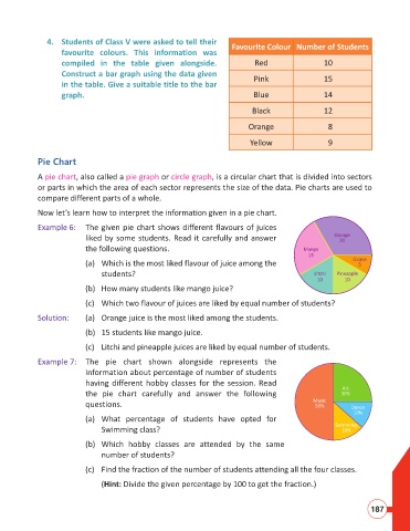
                                                                              Favourite Colour Number of Students
                           favourite colours. This information was
                           compiled in the table given alongside.                    Red                  10
                           Construct a bar graph using the data given
                                                                                     Pink                 15
                           in the table. Give a suitable title to the bar
                           graph.                                                    Blue                 14

                                                                                    Black                 12

                                                                                   Orange                  8

                                                                                    Yellow                 9

                    Pie Chart

                    A pie chart, also called a pie graph or circle graph, is a circular chart that is divided into sectors
                    or parts in which the area of each sector represents the size of the data. Pie charts are used to
                    compare different parts of a whole.

                    Now let’s learn how to interpret the information given in a pie chart.
                    Example 6:  The given pie chart shows different flavours of juices
                                  liked by some students. Read it carefully and answer                       Orange
                                                                                                               20
                                  the following questions.                                          Mango
                                                                                                     15
                                  (a)   Which is the most liked flavour of juice among the                         Guava
                                                                                                                    5
                                       students?                                                       Litchi  Pineapple
                                                                                                        10      10
                                  (b)  How many students like mango juice?

                                  (c)  Which two flavour of juices are liked by equal number of students?

                    Solution:     (a)  Orange juice is the most liked among the students.
                                  (b)  15 students like mango juice.

                                  (c)   Litchi and pineapple juices are liked by equal number of students.

                    Example 7:  The pie chart shown alongside represents the
                                  information about percentage of number of students
                                  having different hobby classes for the session. Read
                                                                                                               Art
                                  the pie chart carefully and answer the following                             30%
                                                                                                       Music
                                  questions.                                                           50%        Dance
                                                                                                                   10%
                                  (a)   What percentage of students have opted for
                                                                                                             Swimming
                                       Swimming class?                                                         10%
                                  (b)   Which hobby classes are attended by the same
                                       number of students?

                                  (c)  Find the fraction of the number of students attending all the four classes.

                                       (Hint: Divide the given percentage by 100 to get the fraction.)


                                                                                                                        187

