
Page 330 - Start Up Mathematics_8 (Non CCE)
P. 330
21 Histogram, Pie Chart
and Line Graph
We have already learnt the tabulation method of arranging data and its graphical representation in a bar graph.
The graphical or pictorial method utilizes various other tools like histogram, pie chart and line graph about
which we will learn in this lesson.
Histogram (Interpretation and Construction)
A histogram is a graphical representation of a frequency distribution Remember
of a grouped data. A histogram is drawn in the form of rectangles In a bar graph, there are
with class intervals as bases with no gaps between any two successive equal gaps between the
rectangles. The rectangles are of equal width and their heights represent bars while in a histogram,
frequencies. there are no gaps at all.
To draw a histogram, we use continuous grouped frequency distribution.
Drawing a histogram
Step 1: Take a graph paper and draw horizontal line OX and vertical line OY. These lines are called X-axis
and Y-axis respectively.
Step 2: Choose a suitable scale for the X-axis and along it represent the class limits.
Step 3: Choose a suitable scale for the Y-axis and along it mark the frequencies.
Step 4: Draw rectangles with the class intervals as bases and respective frequencies as heights.
The scale for X-axis may not be the same as the scale for Y-axis.
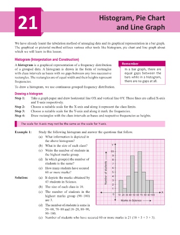
Example 1: Study the following histogram and answer the questions that follow.
(a) What information is depicted in
the above histogram?
(b) What is the size of each class? Y
(c) Write the number of students in 10
the highest marks group. 9
(d) In which group(s) the number of 8
students is the same? 7
(e) How many students have secured 6
60 or more marks? Number of students 5
Solution: (a) It depicts the marks obtained by 4
43 students in Science. 3
(b) The size of each class is 10. 2
1
(c) The number of students in the X
highest marks group (90–100) 0 10 20 30 40 50 60 70 80 90 100
are 3. Marks in Science
(d) The number of students is same in
50–60, 70–80 and 10–20, 80–90,
90–100.
(e) Number of students who have secured 60 or more marks is 21 (10 + 5 + 3 + 3).