Page 44 - Viva ICSE Computer Studies 8 : E-book
P. 44
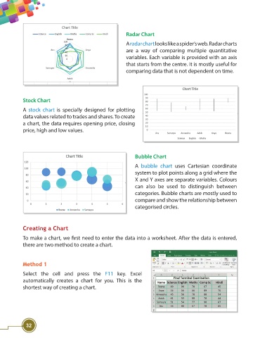
Radar Chart

                                                                    A radar chart looks like a spider’s web. Radar charts
                                                                    are a way of comparing multiple quantitative
                                                                    variables. Each variable is provided with an axis
                                                                    that starts from the centre. It is mostly useful for
                                                                    comparing data that is not dependent on time.


                    Stock Chart
                    A  stock chart is specially designed for plotting
                    data values related to trades and shares. To create
                    a chart, the data requires opening price, closing
                    price, high and low values.


                                                                        Bubble Chart

                                                                        A bubble chart  uses Cartesian coordinate
                                                                        system to plot points along a grid where the
                                                                        X and Y axes are separate variables. Colours
                                                                        can also be used to distinguish between
                                                                        categories. Bubble charts are mostly used to
                                                                        compare and show the relationship between
                                                                        categorised circles.


                    Creating a Chart

                    To make a chart, we fi rst need to enter the data into a worksheet. After the data is entered,
                    there are two method to create a chart.


                    Method 1

                    Select the cell and press the  F11  key. Excel
                    automatically creates a chart for you.  This is the
                    shortest way of creating a chart.


                     32

