Page 42 - Viva ICSE Computer Studies 8 : E-book
P. 42

Types of Charts

                    Some of the most commonly used charts are listed below.

                      •  Column chart                   •  Area chart                     •  Doughnut chart
                      •  Line chart                     •  XY Scatter chart               •  Bubble chart

                      •  Pie chart                      •  Radar chart
                      •  Bar chart                      •  Stock chart                  Think and Discuss

                                                                                       What will happen if there is
                    Column Chart                                                       not legend in a chart?
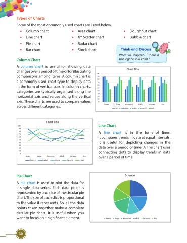
                    A  column chart  is useful for showing data
                    changes over a period of time or for illustrating
                    comparisons among items. A column chart is
                    a commonly used chart type to display data
                    in the form of vertical bars. In column charts,

                    categories are typically organised along the
                    horizontal axis and values along the vertical
                    axis. These charts are used to compare values
                    across diff erent categories.


                                                                         Line Chart

                                                                         A  line chart is in the form of lines.
                                                                         It compares trends in data at equal intervals.
                                                                         It is useful for depicting changes in the
                                                                         data over a period of time. A line chart uses
                                                                         connecting dots to display trends in data
                                                                         over a period of time.


                    Pie Chart

                    A  pie chart is used to plot the data for
                    a single data series. Each data point is
                    represented by one slice of the circular pie
                    chart. The size of each slice is proportional
                    to the value it represents. So, all the data
                    points taken together make a complete
                    circular pie chart. It is useful when you
                    want to focus on a signifi cant element.


                     30
   37   38   39   40   41   42   43   44   45   46   47